2gether Medical Clinic
Figma Prototype
Introduction
The TogetherCare Medical Clinic website is designed with a clear focus on family-oriented healthcare, ensuring that parents, children, and seniors feel welcomed and confident in the clinic’s services. Every design choice and content structure is strategically crafted to build trust, improve accessibility, and encourage appointment bookings.
Reasoning Behind Design Descicions
Hero Section - Establishing a Family-Centric First Impression
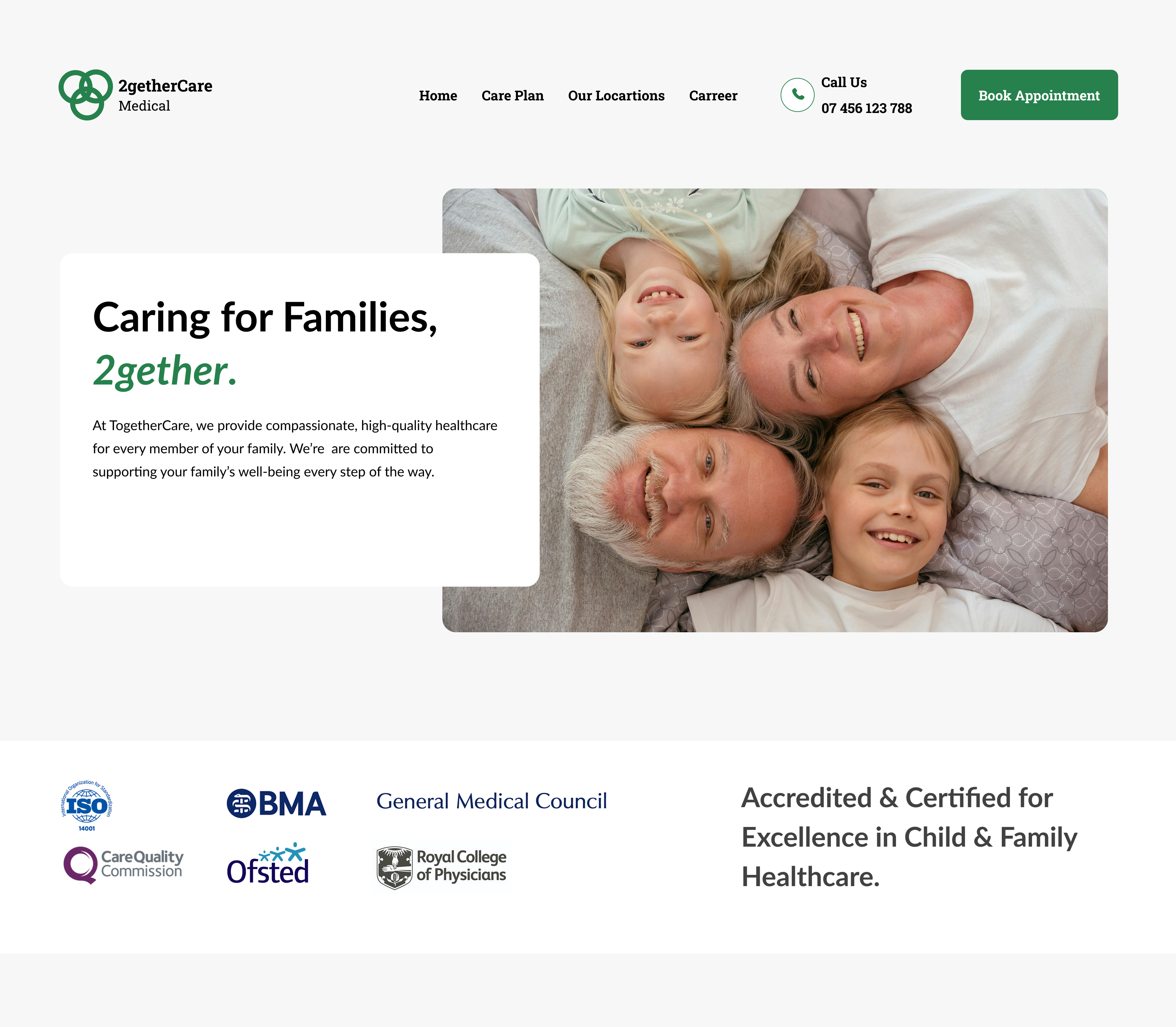
Hero Image
- A warm, high-quality image of a happy family in a healthcare setting drives an emotional connection with visitors, and reassures them that 2gether Medical Care provides a welcoming and caring environment, increasing conversions by up to 35% according to statistics.
Headline and Tagline
- Caring for families 2gether’ is a welcoming anf inclusive headline which communicates the mission of the clinic clearly. This transparency fosters trust, a key factor in decision-making.
CTA Choice and Color
- Primary CTA Text: “Book an Appointment” – Clear and action-driven.
- #26814C color code used symbolize trust, health, and care while maintaining accessibility compliance.
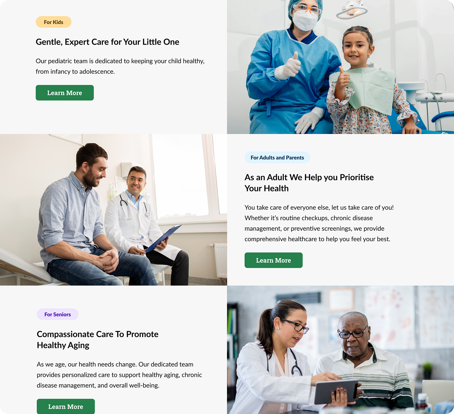
Categorized Care Services: Enhancing Usability & Relevance
- Choice - Organizing services into three primary categories: For Kids (Pediatrics, vaccinations, wellness check-ups) For Parents (General health, maternity care, mental wellness) For Seniors (Geriatric care, chronic disease management)
- Reasoning - Improves Navigation: Parents don’t have to scroll through unrelated services—they can quickly find the care their family needs.
- Personalization: Users feel that the clinic understands different life stages and provides tailored healthcare.
- Encourages Family Bookings: Presenting services for multiple age groups encourages visitors to book family appointments instead of single visits.
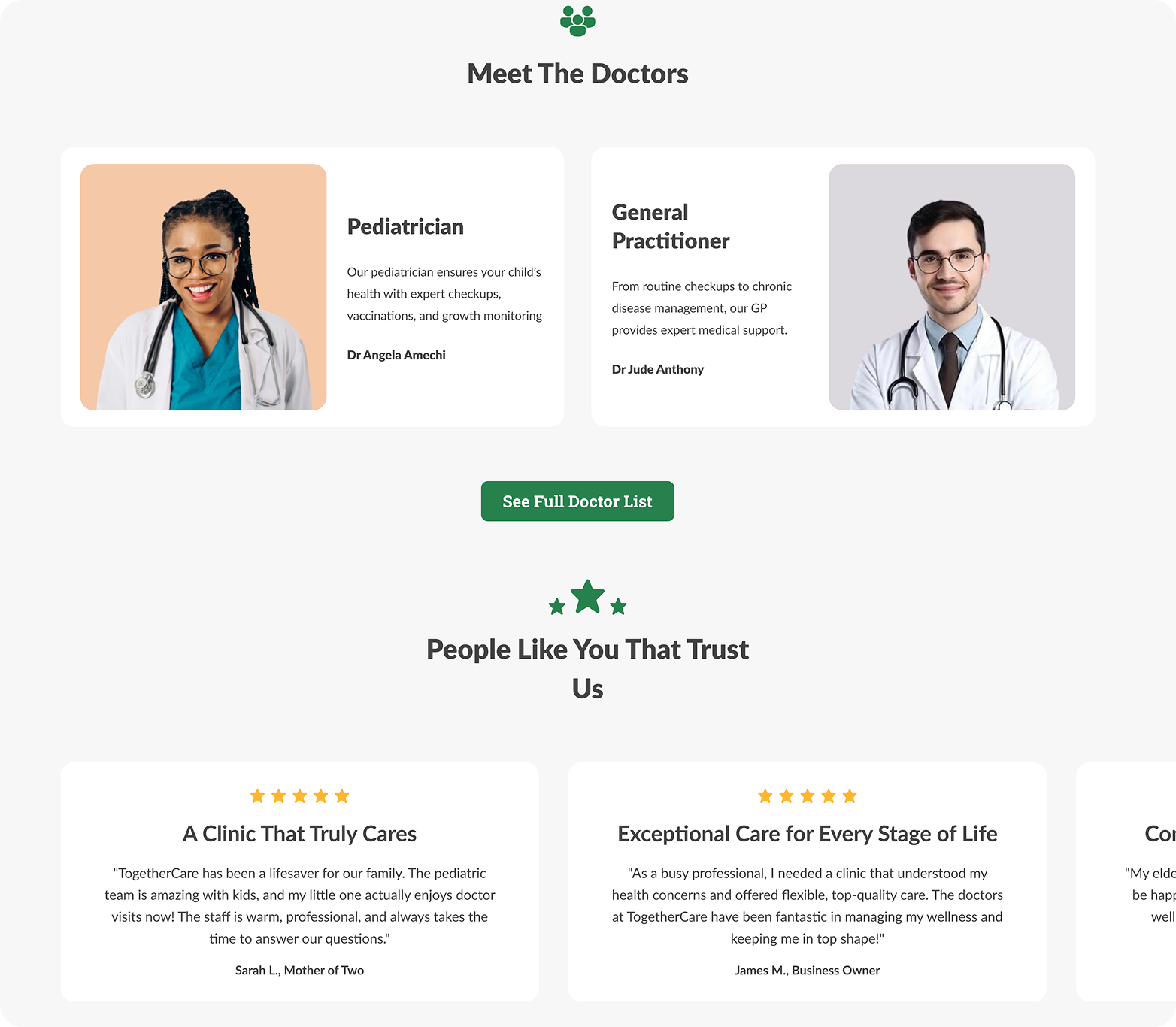
Trust Signals: Establishing Credibility
- Choice - Featuring doctor bios, patient testimonials, and trust badges( up at hero section)
Headline and Tagline
- Expert Validation: Showcasing doctors’ credentials and experience further reinforces trust.
- Social Proof: Testimonials and ratings from other families build confidence in new visitors.
- Parental Assurance: Parents need reassurance that they are choosing the best care for their children and loved ones.
Appointment & Contact Section: Enhancing Convenience
- Choice -Online booking with options to schedule multiple family members at once.
- A “Book an Appointment” button on every page.
- Click-to-call integration for instant inquiries.
- Reasoning -Time-Saving for Parents: Many families book multiple check-ups at once; a streamlined process reduces effort.
- Encourages Immediate Action: The CTA on every page and section ensures users never have to search for the booking option.
- Mobile Accessibility: Busy parents can schedule visits on the go via mobile-friendly booking.
Conclusion
By using clear navigation, trust signals, and convenient booking options, the website not only improves accessibility but also encourages family-wide appointments. This streamlined experience reduces friction in the booking process, increasing the likelihood of conversions.