Website redesign with a focus on improving product discoverability through an enhanced filter functionality
Role :
User Experience Designer (UX)
User Interface Designer (UI)
Interaction Designer
Duration :
3 Weeks
Outcome :
UI UX Design
UX Research
Interactive Prototype
Project Goal.
The primary goal of this project was to refine the search experience of an online ecommerce book shop through a more intuitive and stremlined filter functionality. In addition to this, efforts were put in place to elevate the overall look of the website by adopting modern and more visially appealing measures, reduction of cognitive load of users and generally improving the experience of the website.
Background and Problem Discovery
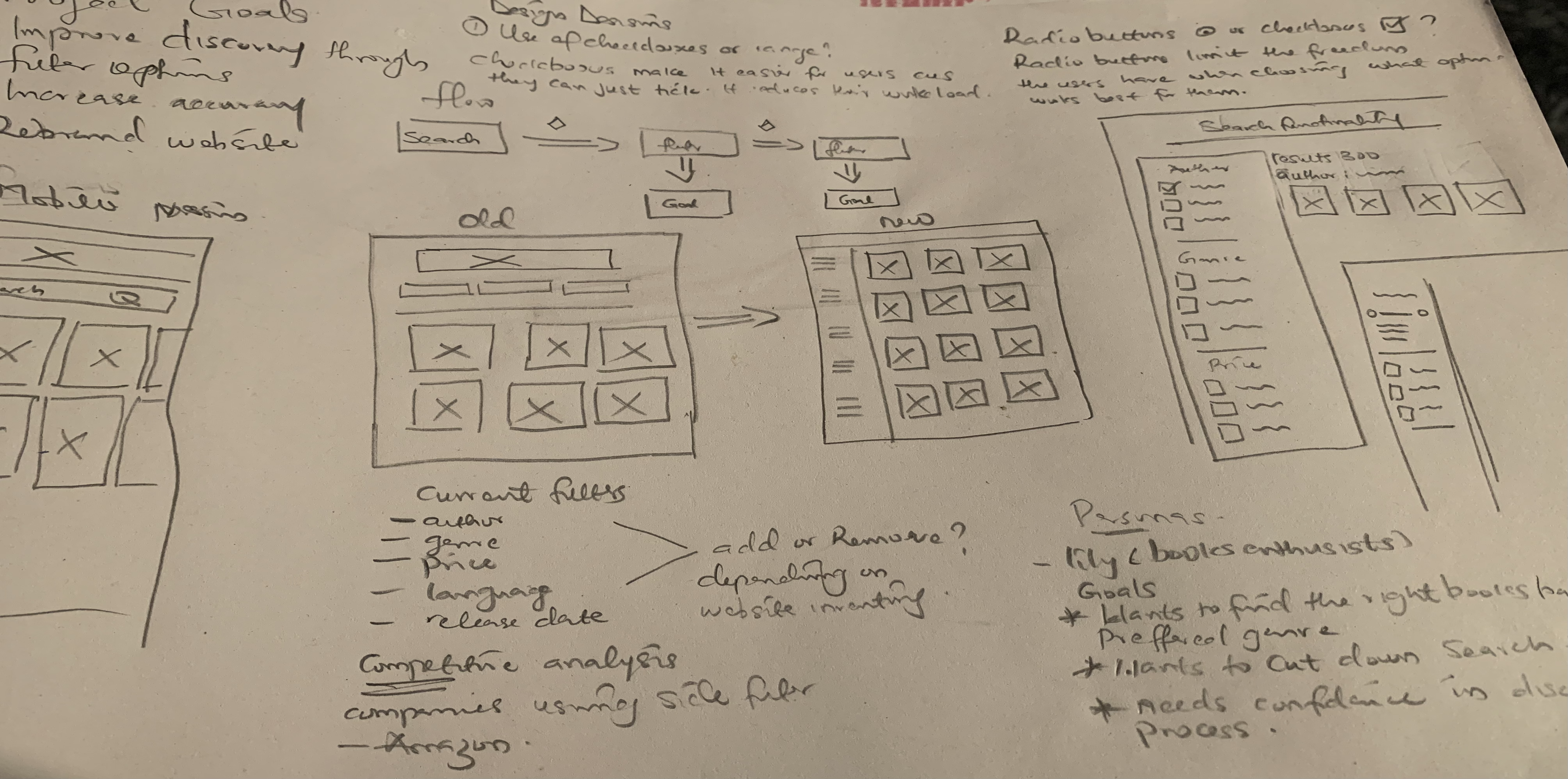
This project is based on an outdated ecommerce book shop called Marvin books. Upon inspection of the website, the existing filtering mechanism on the website were comprised of 5 dropdowns that only allowed users to filter by one property of a dropdown at a time. This was a major usability issue as users were greatly limited in their freedom and flexibility to explore results as desired. See below for a better visual understanding
Old Website
After selecting a property from a category dropdown, the filter dropdown itself was removed and this led to two further problems
- 1. The inability of the user to select other attributes pertaining to that particular filter dropdown as all its attributes along with itself was removed. The only way the user could backtrack was to hit reset which would refresh the whole filter functionality and no matter how far they had gotten in the search, they would be back to square one.
- 2. There was no trail of the filters a user had selected. This forced the user to make a mental note of the filter options they had chosen which consequently led to an increased cognitive load, higher frustration levels and eventual drop off from the website.
Possible Solutions
Following the analysis of the existing usability issues, i arrived at a set of possible solutions
- 1. Firstly,I had to devise a much better layout for the filter mechanism. One that would ensure, scalability, give users the freedom to be in control of their search and provide a visual trail of filter options that had been selected by them, there by reducing the cognitive load and frustration levels of the users.
- 1. Futhermore, i had to carry out some research to delve into what users prioritise when filtering for books on the website. By presenting to them what filter options they would most likely be keen to use, this would enable them find their preferred books quickly and more efficiently.
Research
Based on the possible solutions laid out, it was time to gather insights that would serve as the foundation for the redesign
- Interview Insights
- Genre
- Author
- Price range
- Ratings and Reviews
- Language
- Release Date
- Design Exploration and Competitive Analysis
I held interview sessions with the users to gain insights into what filter options they prioritise. This is represented diagramatically below
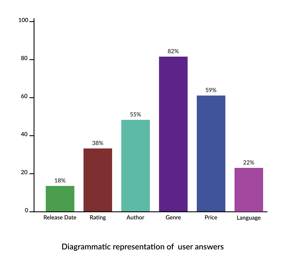
With this topping the list at 83%, users commonly appereciate the abilityy to narrow down thier search based on the specific genres, catering to their varied literacy preferences.
Following closely behind, a significant portion of users find it crucial to filter books by their favorite authors, streamlining the process of discovering new release from preferred writers
Its no surprise that budget considerations are important and users value the option to filter books based on their Price range to stay within their spending limits
From the research, it was discovered that many users rely on filters relating to ratings and Reviews helping them identify well received books and make an informed decision.
The ability to filter by languge allows users to choose books based on their literal fluency.
lastly, Some users find it helpful to filter books by release date, enabling them to discover new releases or focus on recently published titles
In a bid to devise a more intuitive filter functionality and present it in a well structured manner, i analysed a couple of existing e-commerce websites to know what layout were being used, how these were presented to users as well as their respective strengths and weaknesses
EBAY
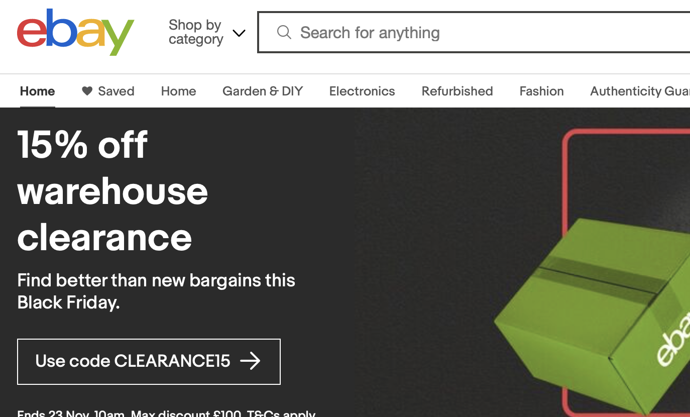 Ebay uses a top filtering bar to facilitate product discovery. There are pros and cons to this type of display which i
will cover below
Ebay uses a top filtering bar to facilitate product discovery. There are pros and cons to this type of display which i
will cover below
Pros
- This type of filters are easibly notoceable and accessible,thereby improving user awareness
Cons
- Ths type of filtering bar is not scalable. If the number of filters were to increase, the top bar would become cluttered and complex, negatively impacting user experience.
- Options of the individual filter categories cannot be viewed at a glance, prompting the user to interact with them thereby increasing the number of clicks before they get to their goal.
- As filters are fixed at the top of the bar, users may need to stroll back up to the top of the page to access filters which can be inconveneient in lengthy content.
KAYAK
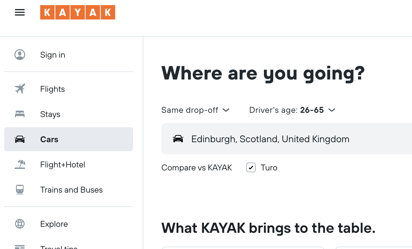 Kayak on the other hand is an e-commerce sites that uses a left bar facilitate product discovery.
As expected, this design has its pros and cons as well.
Kayak on the other hand is an e-commerce sites that uses a left bar facilitate product discovery.
As expected, this design has its pros and cons as well.
Pros
- This type of design prominently positioned as well, enhancing user interaction.
- This method of display allows for a hierarchical arrangement of filters, facilitating a more organised and and detailed categorization.
- The filters are expandable and run alonge the lenghth of the page. Hence if more filters needed to be added, that could be easily done design and development wise.
Cons
- This type of design might require adjustments for optimal display on smaller screens or mobile devices.
After analysing the pros and cons of each filter design, i opted for the left side filter as the pros outweighted the cons and was more suited to the nature of the ecommerce website i was building.
Final Design
After completing the previous steps, i proceeded to get some UI inspiration across the web and came up with the final design below
Where the usability issues resolved?
Upon finalizing the design, i took a quick trip down memory lane to review the original usability problems and compare then with the new design
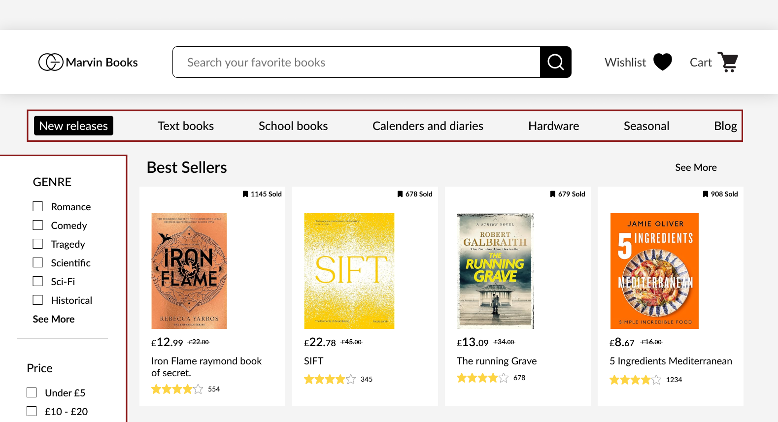
As seen in the highlighted area, the new design adopts both a top and left side filtering bar. The top bar plays a secondary role as it presents a general overview of the website. The left side bar being the primary filter mechanism and having the feature of being scrollable, houses the filtering options users are more keen to adopt in their search based on the research. As against the old design, The properties of each filter option in this new design is laid out visually for the user promptimg them to instinctively selct what property best matches their preference.
In addition to that the information is presentred in a way that is not overwhelming to the user with the help of the "see more " feature that hides away some properties. Futher more, users now have the opportunity to select a different property of a filter option without having to refresh the website as was prevalent in the old design.
I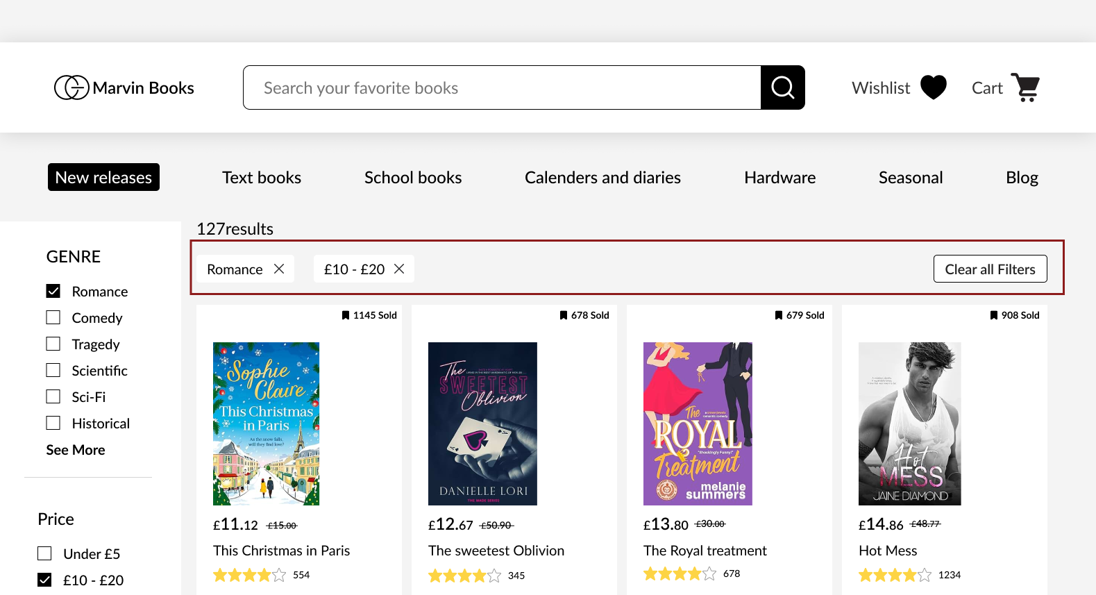
As seen in the highlighted area, the new design provides a visual trail of filter option that had been selected by the user. This re-enforces the users actions and ensures they have full control of the search process.
Mobile Responsiveness
There was no mobile responsiveness for the original design, so i decided to add one as part of the redesign process
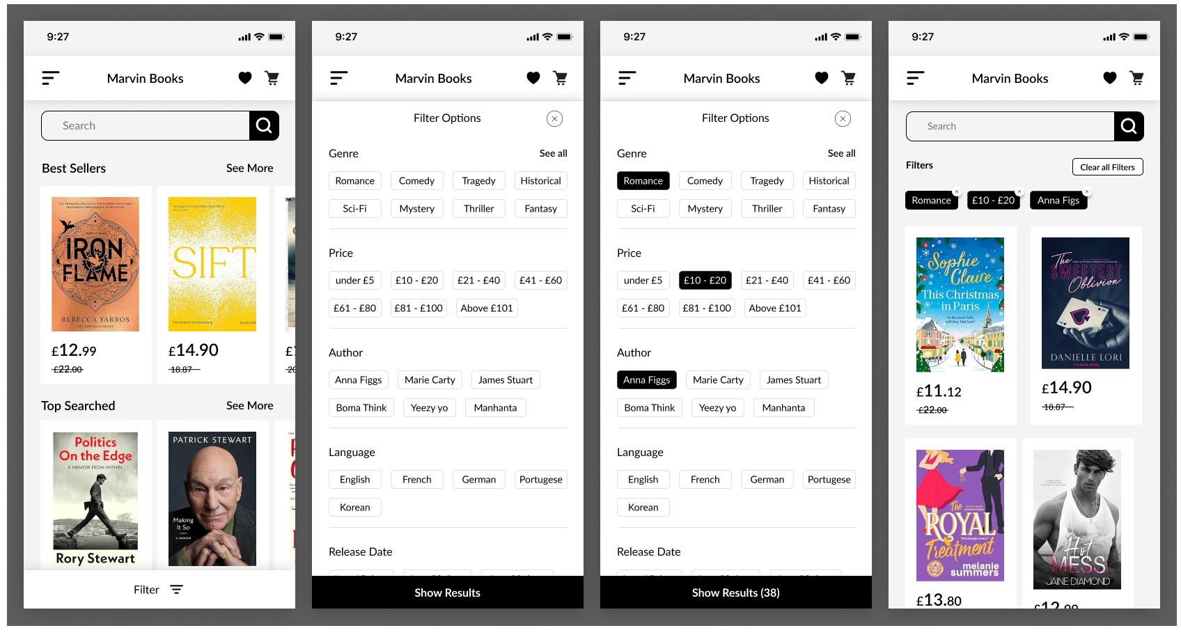
Due to the limited space on mobile screens, i adopted a bottom filter bar. With the bar being fixed at the bottom and visually compelling, it would be hard for users to miss it. Studeis have also shown that users are more likely to click on buttons located at the bottom of the mobile screen as it as its within favourble distance from the thumbs.
Conclusion
If you have gotten to the conclusion of this case study, i want to say thank you for reading through. The goal of the design process was to imporove product discovery through an enhanced filter functionality and i believe that was met in the cousre of the design process. Ofcourse with design processes, there is not a definite "end" as it is a continously looping preocess. That being said, if the need arises, there would be a second round of usability testing and refinement to the design to continously meet the needs of the users. I would be happy to hear from you if you would like to propose any changes or share your opinions about the design process thank you.