A SAAS B2B and B2C web-based application to help E-Commerce sellers manage multiple storefronts and provide insights into profit margins.
Role :
User Experience Designer (UX)
User Interface Designer (UI)
Interaction Designer
Duration :
4 Weeks
Outcome :
UI UX Design
UX Research
Style guide and UI components
Interactive Prototype
Project Goal.
The goal of the project was to elevate a preliminary web application that offers valuable insights into enhancing profit margins through a comprehensive understanding of profitability at SKU levels (a unique number used to identify and track products).In addition, the platform facilitates centralized organization for tracking and managing multiple storefronts efficiently.
Challenge
The initial application which encapsulated the fundamnetal components of the product itself, was quite overwhelming. This was as a result of the nature of the substantial data involved. The client acknowledged the need to streamline processes and enhance user experience.
Solutions
The UX team aimed to improve the existing product by applying UX best practices to effectively structure extensive data sets. Through modifications in typography, implementation of visual hierarchy, and incorporation of other UX best practices, the team sought to provide users with the flexibility to navigate and comprehend the potentially overwhelming volume of data more seamlessly.
The Process
For ease of understanding, project was divided into phases with each phase giving more context and supporting the overall completion of the project.

Discovery
The process kicked off with the designers having a meeting to review the details and content supplied by the client. In the course of the meeting, we identified the project's scope, problem, proposed solution, and strategies for its effective implementation. Understanding the significant volume of data to be presented, the client acknowledged the need for an improved user experience. The client's primary emphasis was on ensuring that users comprehensively understand their profitability at both the order and SKU levels.
- Client Questions
- Certain elements from the initial mock-up were essential to include in the final product
- The client is willing to explore options beyond the current style guide
- Images of the products were not crucial
- Competitive Analysis
- Presents a fluid unification of multiple seller platforms
- Produces reports for analysis
- Contricted product views
- Their main focus is not E-commerce
- Presents a fluid unification of multiple seller platforms
- Produces reports for analysis
- Contricted product views
- Their main focus is not E-commerce
- Presents a fluid unification of multiple seller platforms
- Produces reports for analysis
- Contricted product views
- Their main focus is not E-commerce
- Heuristic Evaluation
- Overwhelming amount of information
- Lack of user control and freedom
- Lack of explanation of graphs
In an attempt to grasp the project's scope, the team raised relevant questions aimed at obtaining a more profound understanding of the project. I took an active role in curating some questions for the client to help us get a clear understanding of the scope of the project. Some of our findings were:
Given the designers' unfamiliarity with the industry, the client willingly provided detailed explanations of the page components and their user-centric benefits. This collaborative effort ensured that the team and I possessed the essential information required for the successful execution of the project.
The team conducted a comprehensive competitive analysis to understand the industry standards. Through this analysis, we examined similar companies already in existence, their strengths and weaknesses, with the aim of identifying potential advantages for GorMart. In the process, we successfully pinpointed the top three competitors.
Competitor 1 : Gleww
Strengths
Weakness
Competitor 2 :
Strengths
Weakness
Competitor 3 : Gleww
Strengths
Weakness
We carreid out a heuristic evaluation of the preliminary product supplied by the client to assess specific pain points users encountered. Some of the key findings were:
Both the client and the team recognized that placing a significant emphasis on the user experience would be pivotal in establishing the product as a standout in the market.
Key Takeaways
The Initiated research at the start of the design process stood out as a pivotal phase. This aided the team in establishing a collective understanding of the goals to be accomplished by the conclusion of the design process. Through the research, we successfully identified industry standards:
- Having a seamless integration of multiple seller platforms
- Allowing connections to multiple e-commerce
- Having the ability to see multiple data sets in one centralized location
We also pinpointed areas in which the team could improve upon the initial product. These enhancements include:
- Overall lift of user interface
- Apply UX best practices such as visual hierarchy to data-heavy components to prevent cognitive overload to the end user
- Provide more documentation on the pictures and graphs
Ideate
User Stories
The team received user stories from the client, aiming to encompass key components of GorMart and later transforming them into detailed narratives.These narratives formed the groundwork, enabling us to outline our user journey, screen by screen. Here are the specified user stories:

"As a user, I want to create an account and view my profile"

"As a user, I want the view products and orders to review"

"As a user, I want to view the KPI's with filters"

"User Flow 4: As a user, I want to view product performance"
User Flows
After examining the user stories, the team initiated a follow-up meeting to discuss their evaluation. During this evaluation, questions arose, particularly regarding the categorization of users involved in the project (e.g., managers, e-commerce sellers) and the quantity of user types. It became evident that a meeting with the client was imperative to gain a comprehensive understanding of the project's scope. This meeting would enable the team to determine the necessary variations for each user flow. I proactively addressed user story 4: As a user, I want to view the product's performance. By crafting user flows, I gained valuable insights into the user's journey toward achieving this goal. My primary aim was to guide the user to their objective in the most efficient manner, minimizing the number of steps required.

UI Inspiration
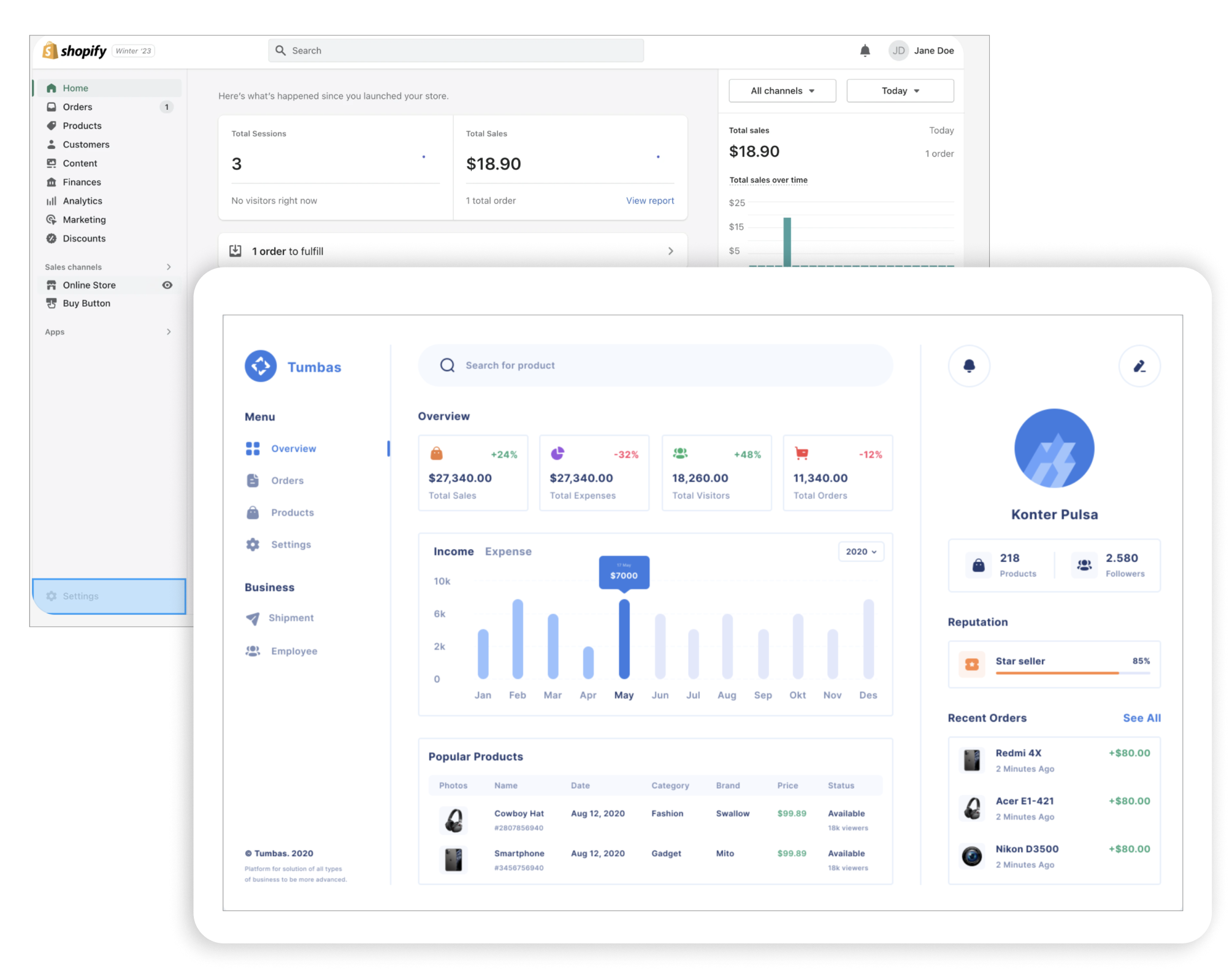
The team and I curated inspirations to envision the desired overall tone and UI for GorMart. During our collaborative meeting, each team member presented their respective inspirations. Our collective aim was to establish a clean and modern aesthetic, aligning the product with industry standards. This involved incorporating interactive elements to enable user feedback. I selected products like Shopify as my sources of inspiration because it not only thrived in the e-commerce industry but also boasted a user base in the millions. Shopify consistently presented a modern and clean appearance, skillfully utilizing space without inundating the user. I believe that it delivered a sufficient amount of information, focusing solely on what is relevant to the user and their requirements.
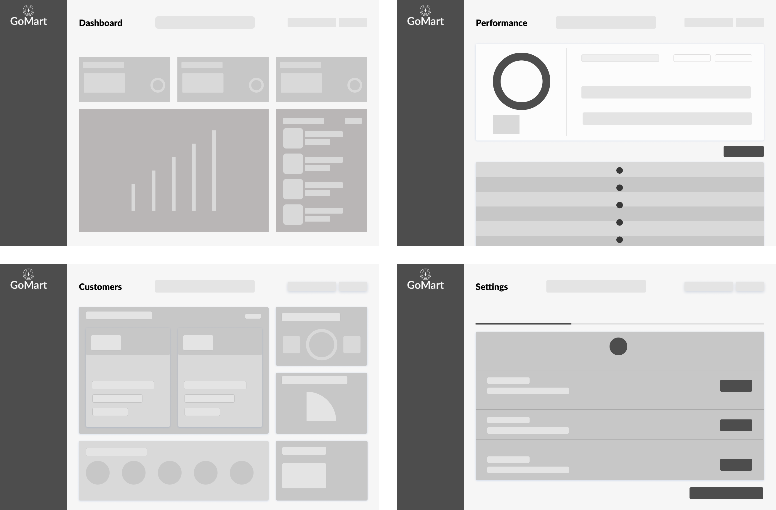
Low Fidelity Wireframes
Each designer presented their low-fidelity wireframes specific to their designated user flows. This presentation fostered a collaborative environment, enabling the team to openly share insights on what each designer deemed beneficial for both the user experience and the business objectives. While developing my low-fidelity wireframes, I concentrated on efficiently utilizing available space. My goal was to present essential key performance indicators (KPIs) in a tidy and organized fashion, with the chart serving as a focal point alongside the KPIs.
Medium Fidelity Wireframes
In this stage of wireframing, our primary objective was to effectively present data without overwhelming the user. Given the substantial amount of data involved in this product, it was particularly important for the team to implement UX practices to avoid cognitive overload for the end user. Among the key best practices are:
- Implementing a visual hierarchy
- Employing color cues upon clicking a product
- Including only essential information in the Key Performance Indicator (KPI) cards
We aimed to address business requirements by enhancing user engagement. This involved introducing a diverse set of filters and incorporating additional UI elements, such as dropdowns and sliders.
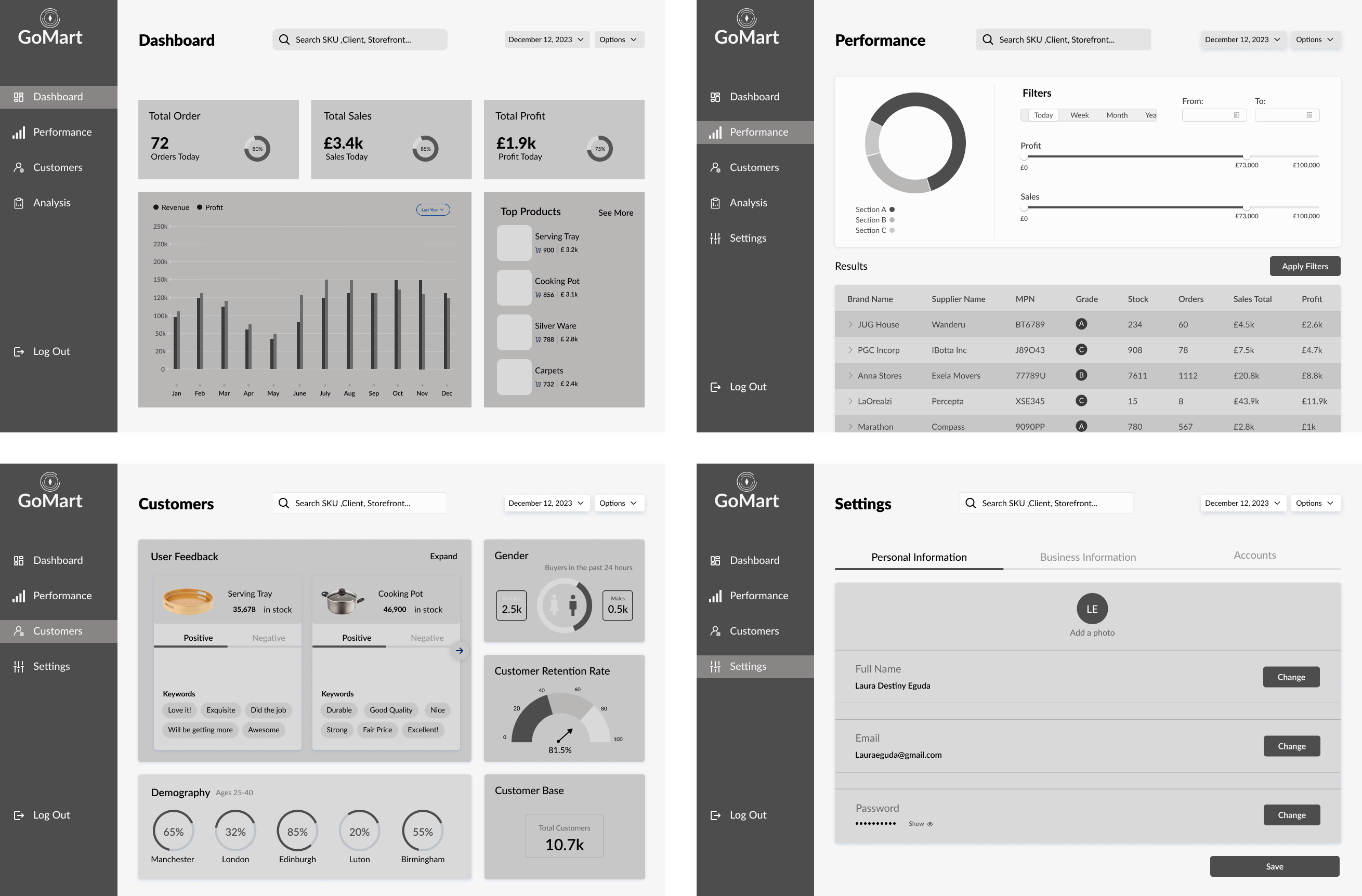
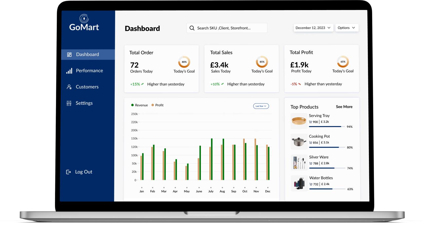
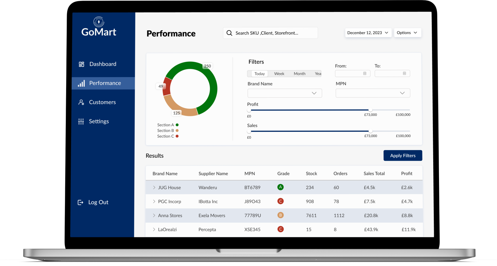
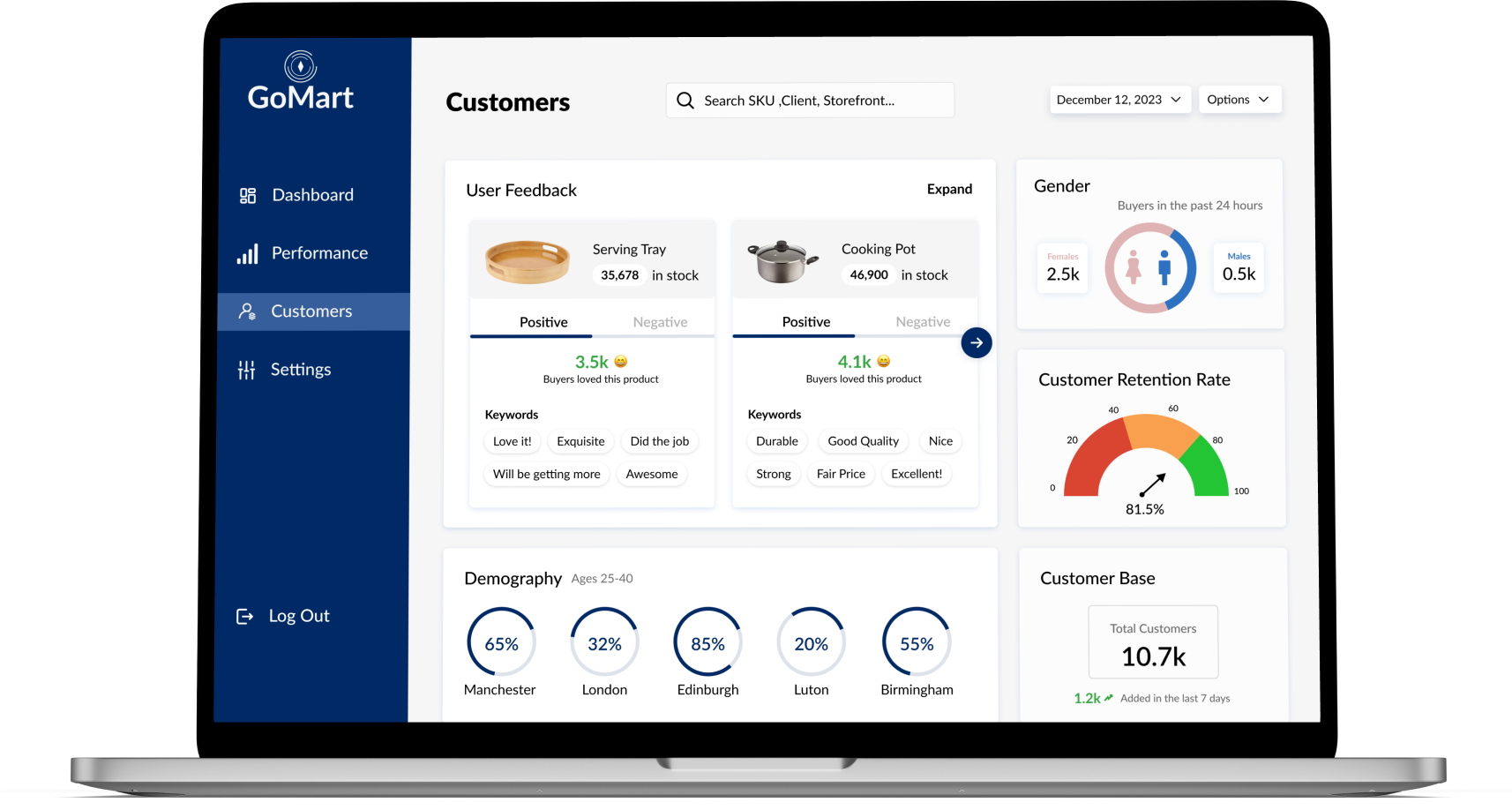
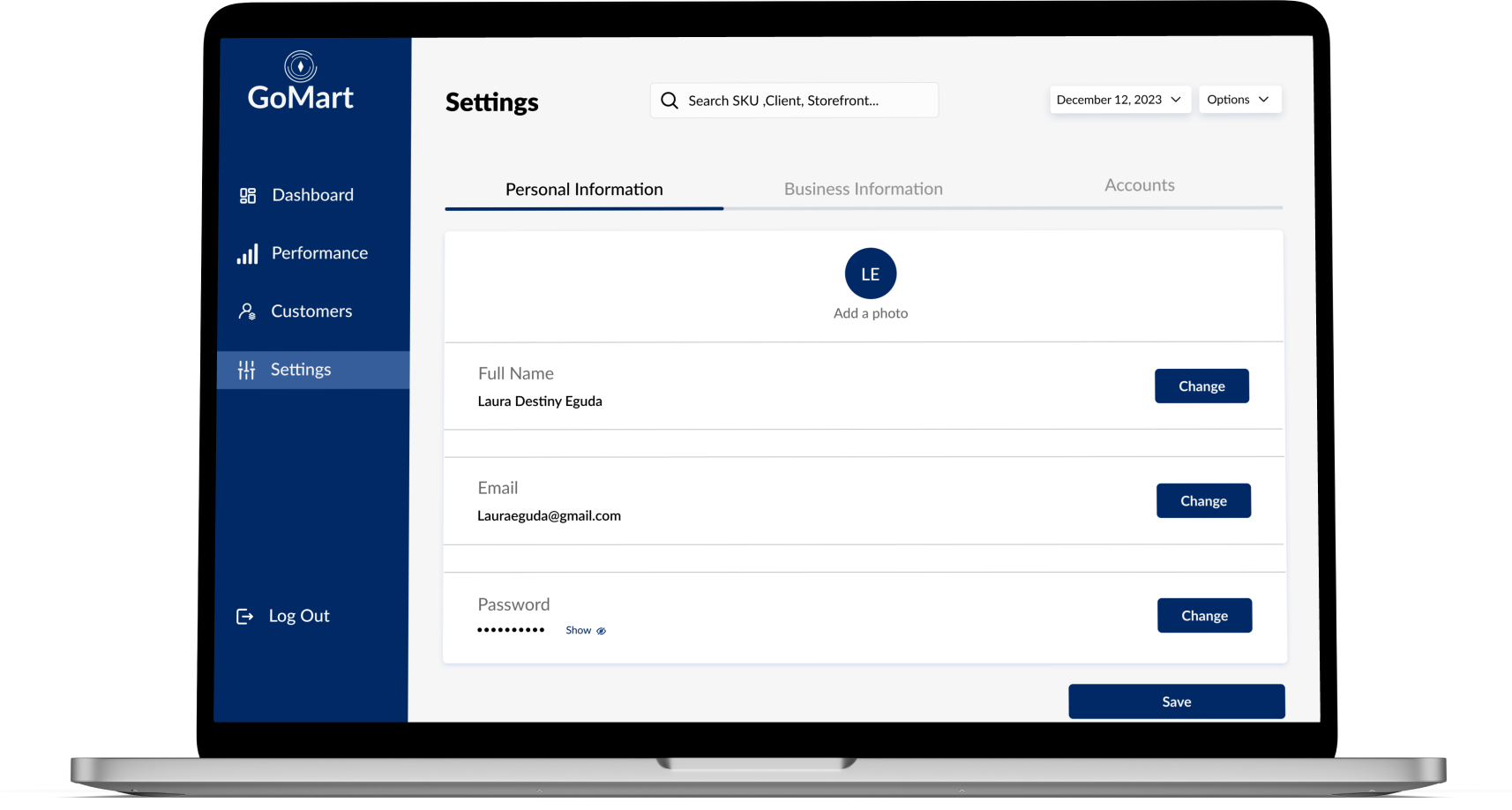
High Fidelity Screens
During this phase, my team and I applied the aesthetic and UI layout chosen from the UI iteration consistently across all screens, effectively bringing each screen to life.
This visual approach allowed users to interpret information without necessarily reading. Additionally, I incorporated specific iconography to signal users t hat clicking would reveal additional information about the product.
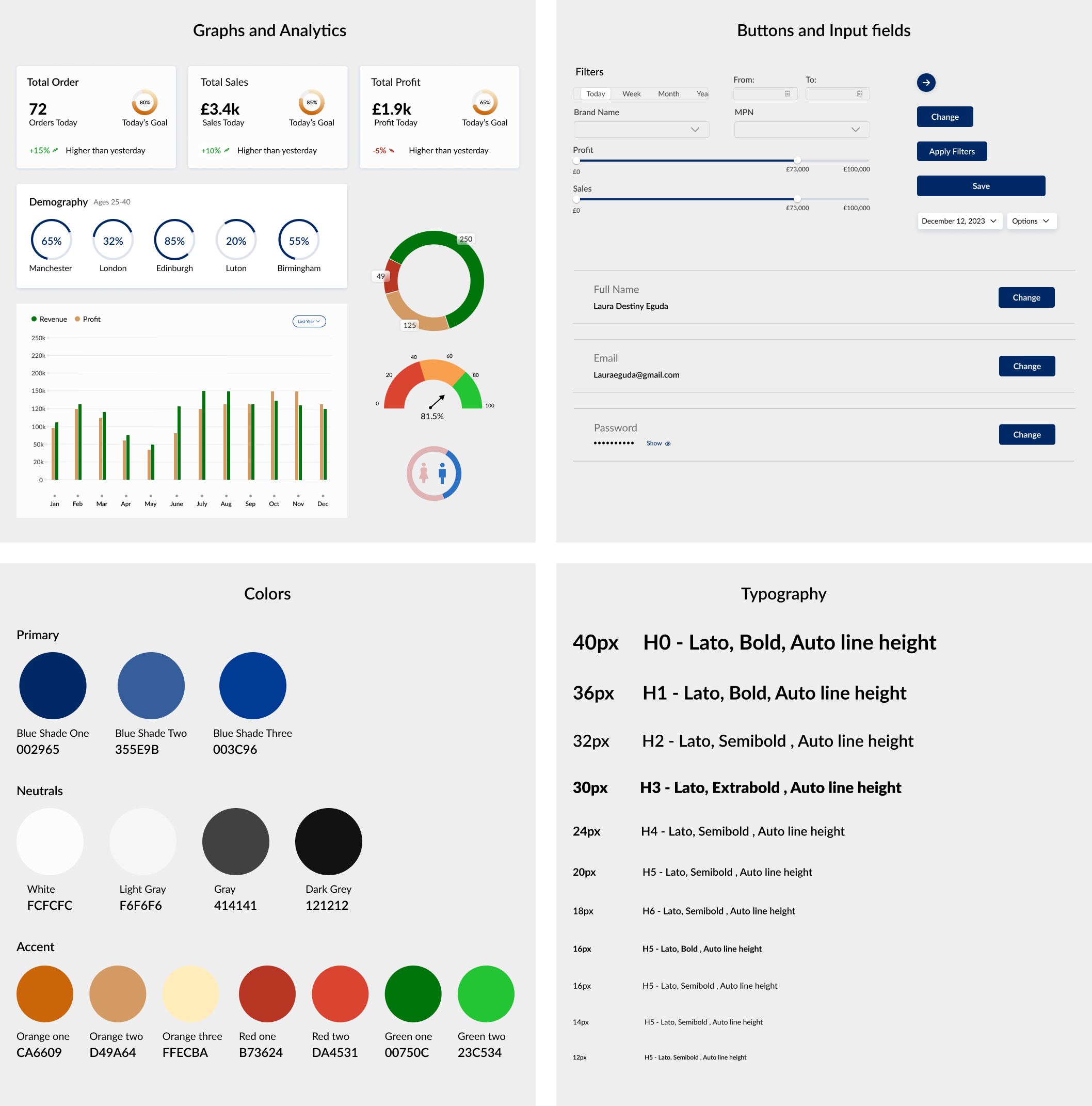
It's worth noting that we aimed to stay consistent with the client's established color palette. However, we observed that the original color, particularly with white text, did not meet the contrast accessibility standards. This issue extended beyond the primary color, affecting other colors too. Consequently, the entire team collaborated to explore alternative color schemes, ensuring better accessibility for users, including those with vision deficiencies.
Final Style guide
The team and I compiled the definitive style guide, designed to be accessible to all stakeholders, including developers requiring specifications for various elements. The style guide encompassed detailed specifications for the following:
Typography: Our team chose Poppins as our font choice because it resonates with the bold aesthetic commonly found in the automotive industry
Reflection
My role at Gomart presented a significant challenge but also a tremendous opportunity for growth as a UX designer. Given my limited familiarity with the automotive industry, I recognized that asking clarifying questions and conducting thorough research would be crucial in the design process based on my past experiences. The initial stages were challenging for the team as we grappled with determining the essential elements from the preliminary product. However, through multiple conversations and a meeting with the client, we successfully identified and pinned down the necessary items for each screen.
Navigating a project with such a substantial volume of data was initially daunting due to my limited experience in this domain. However, this challenge proved to be immensely instructive, providing me with v aluable insights on how to approach similar projects in the future. For this particular project, I discovered that implementing a dashboard and offering users the flexibility to switch between different storefronts was the optimal solution. Yet, I acknowledge that the approach that worked here might not be universally applicable to all data-heavy projects. Looking ahead, I am eager to apply the lessons learned from this experience and explore diverse methods of presenting data-rich content while adhering to UX best practices.